Trends
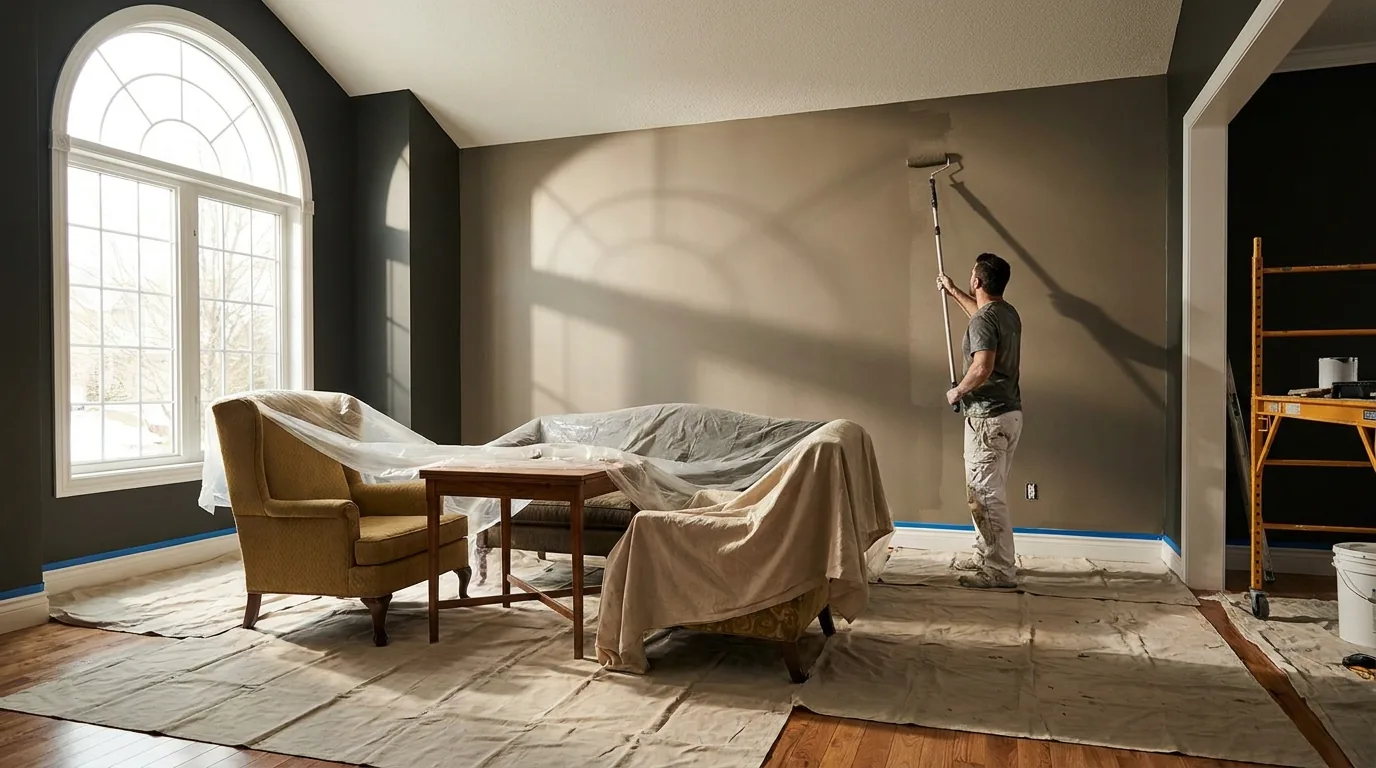
The clearest shift we're seeing in Noblesville homes right now is a move away from the cool gray tones that dominated the last decade toward warm, layered neutrals — soft greiges, warm whites, and creamy tans — paired with deeper, more saturated accent colors in dedicated spaces like dining rooms, home offices, and primary bedrooms.
This isn't a magazine trend disconnected from real homes — it's what we're actually seeing homeowners choose when we're on-site quoting jobs across Noblesville's mix of established neighborhoods and newer developments.
Cool gray had a long run as the default "safe" neutral, but it can read as sterile or cold under Indiana's shorter winter daylight hours — a real, practical reason (not just a style preference) that warmer tones are gaining ground. Warm greige and soft tan tones hold up better across the seasonal light changes Central Indiana homes actually experience, staying inviting in both bright summer light and gray winter afternoons.
This shift shows up most in main living areas — kitchens, living rooms, and entryways — where homeowners live with the color daily and want something that feels warm rather than showroom-neutral.
Where gray-era design leaned toward minimal contrast, we're now painting a lot more deep green, navy, and even black or near-black accent walls in dining rooms, home offices, and primary bedrooms. These work well as a single statement wall or a fully-committed small room (a powder bathroom in deep green is a request we get regularly) rather than spread across an entire open floor plan.
The technical note worth knowing: these deep, saturated colors often need a tinted primer or an extra coat to achieve full, even coverage — budget for that when planning a dramatic color change, since it affects both cost and timeline slightly.
Builder-grade flat white trim — semi-gloss white on every door, baseboard, and window casing — is increasingly being swapped for warm white tones that coordinate with wall colors, or in more design-forward homes, a soft black or deep charcoal trim for contrast. This is a noticeably bigger commitment than a wall color change (trim is more visible throughout the whole home) but it's a request we're fielding more often, especially paired with the warm neutral wall trend.
Warm neutrals tend to have longer staying power than the trend cycles of bolder colors — this is part of why they're gaining popularity, as a safer long-term choice compared to a very of-the-moment bright hue.
Not required, but contrast between trim and wall — even subtle contrast — tends to make a room read as more intentionally designed rather than accidentally monochrome; full color-matching walls and trim is a specific, more minimalist look that works best in modern-styled homes.
A single accent wall in a smaller room (powder bath, home office, dining room) lets you commit to a saturated color with much lower risk and cost than doing an entire open-concept living space.
Warm neutrals throughout main living spaces are broadly resale-safe; saturated accent colors in one or two rooms generally don't hurt resale value as long as the rest of the home reads neutral and move-in ready.
We'll bring color guidance to your free estimate and help you land on something you'll still love in five years — not just this season.
Low-VOC paint has closed the performance gap with standard paint in the last several years — here's what the labels actually mean and when it matters most.
Read MoreReal price ranges for Carmel interior repaints, broken down by room and square footage — plus the five factors that actually move your number up or down.
Read MoreMay through early October is the real window for exterior painting in Central Indiana — but the calendar matters less than temperature, humidity, and dew point on the actual application day.
Read MoreTell us about your project — no cost, no obligation. We'll follow up with a written quote.